Following on from yesterday’s post, more of the 2015 team jerseys.
 Not as extravagantly pink as they used to be, there’s no huge changes compared to last year, the green has been toned down a touch so it’s less bright lime and more subtle.
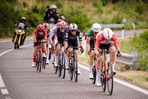
 Lotto are keeping up their slightly retro take on their jerseys. The red bar in the centre logo makes it slightly less clear on the chest, but they’re dead easy to see and it’s nice to see something different.
 Same old Movistar, there may be a tiny change on the collar but it’s the easiest designer job there is.
 No discernible changes here, ironically my favourite team jersey of theirs was the black 2012 version.
 The merged Cannondale and Garmin teams have concocted this. Using Garmin’s trademark argyle pattern with black (boo!) and Cannondale’s standout green. You can’t help but feel a reversed colour version would’ve been better.
 This is a reversed colour scheme from Giant-Shimano’s team jersey last year, however from white to black. Hopefully the new Alpecin logo and its red areas will make them stand out.