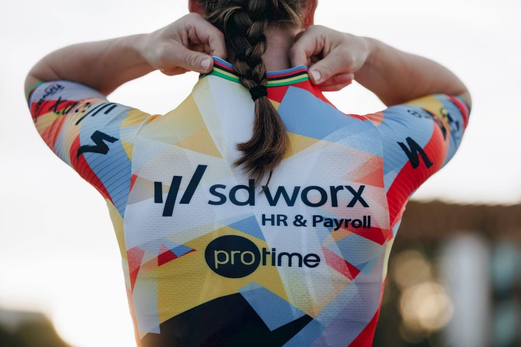
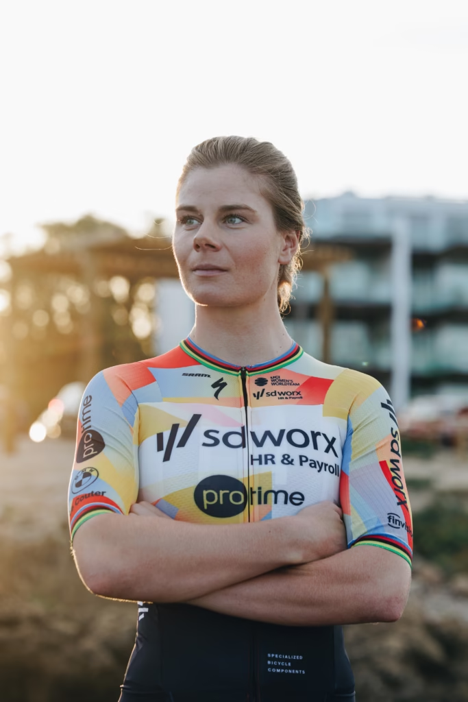
Team SD Worx-Protime have lifted the curtain on their 2026 look, unveiling a kit they’ve named New Dawn. It marks the end of the purple identity the team has worn since 2021 and introduces a brighter, more expressive palette centred on red, blue and yellow. For a team that has long defined the standard in women’s cycling, the new design represents both a shift in tone and a refreshed sense of purpose.
Specialized worked with SD Worx and Protime to create the new jersey, which replaces the familiar purple with a mix of colours that feel warmer, cleaner and noticeably more dynamic. The signature spark motif remains, but now appears in multiple shades across the jersey, a nod to the team’s long-held idea of sparking success – translated here in a more literal, eye-catching way.
The structure behind the launch may lean towards corporate language, but the effect of the redesign is simple enough: SD Worx-Protime wanted a kit that feels fresh, energetic and distinctly different from what came before.
Kopecky: “A special jersey that will stand out”
Lotte Kopecky welcomed the new look, noting its novelty and the personal meaning it holds after her return to SD Worx-Protime colours.
“This is a special jersey that will definitely stand out in the peloton,” she said. “It’s the first time since 2023 that I’ll be racing again in the team colours of SD Worx-Protime. That was a great season for me. I hope to achieve beautiful victories in this jersey in 2026. The kit is a bold change, which will take some time to get used to. But we will certainly honour this jersey.”
For a rider who has become synonymous with winning, her approval gives the kit an immediate sense of authority.

Van der Breggen: “Colourful, powerful, unique”
Team manager and former Olympic champion Anna van der Breggen echoed that sentiment, framing the design as an expression of intent.
“The ‘New Dawn’ kit radiates energy and ambition. This design is colourful, powerful, and unique – exactly how we want to be as a team. I’m looking forward to racing in this jersey and hopefully achieving many successes together as a team.”
A deliberate move away from purple
Since 2021, SD Worx-Protime’s variations of a purple kit have been one of the most recognisable visuals in the women’s peloton, worn in countless victories from Strade Bianche to the Tour de France Femmes. Changing it is not a minor decision, and the switch to a lighter and more varied palette marks a notable shift in how the team wants to present itself.
SD Worx-Protime insist that New Dawn is not simply a colour change, but a sign of how the team intends to move forward as the women’s peloton becomes increasingly competitive and commercially sophisticated. In practice, it feels less like a grand statement and more like a natural, well-timed rebranding: a team with a winning culture choosing to start the season with a clean visual slate.
And judged simply on its appearance, the new kit will be impossible to miss when the WorldTour resumes. It is brighter, lighter, and unmistakably bold – an identity shift that says as much about the team’s confidence as it does about its design philosophy.